Charts and Visualizations
Probly provides powerful charting capabilities to visualize your spreadsheet data.
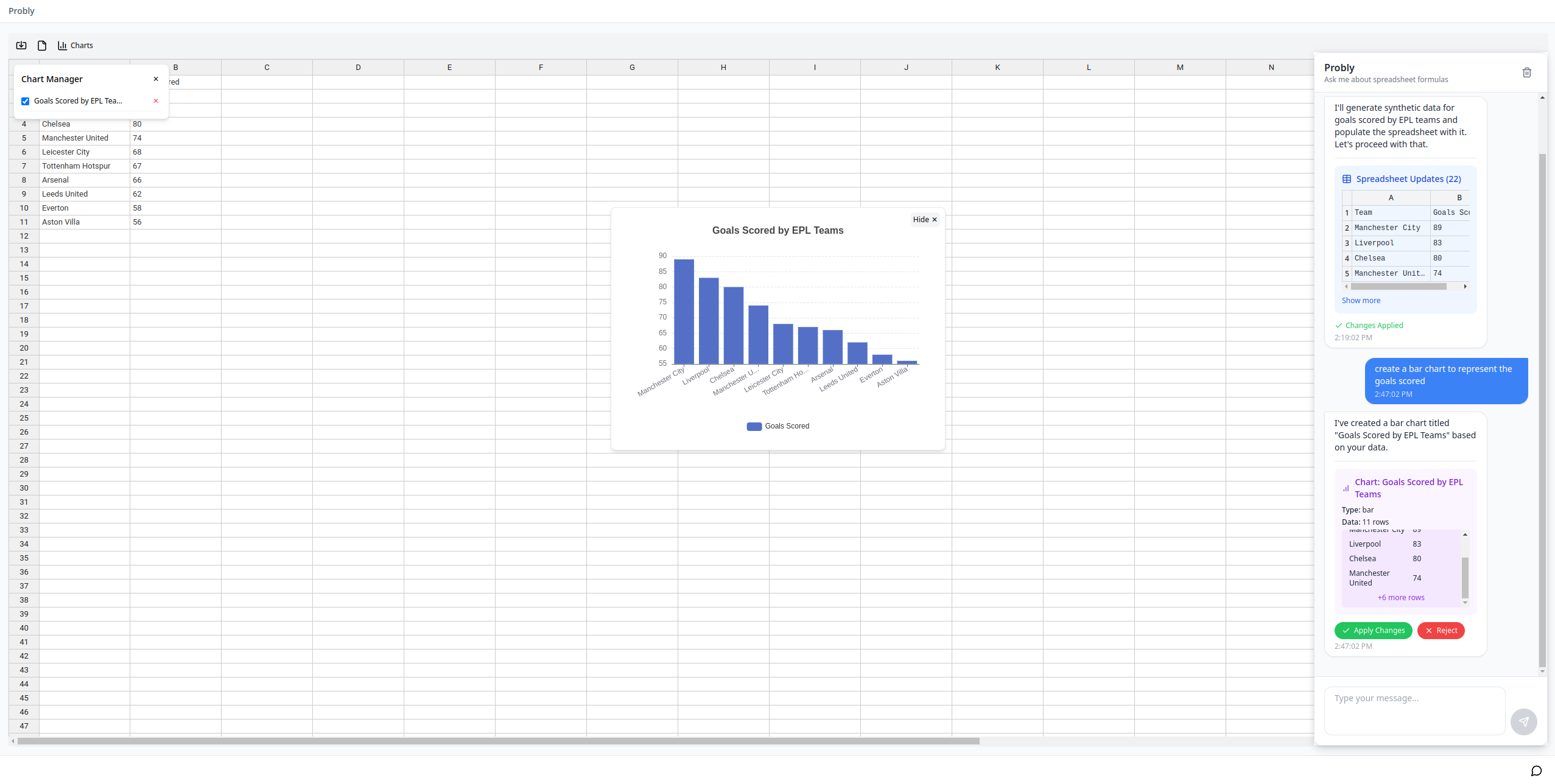
Available Chart Types
- Bar Charts: Compare values across categories
- Line Charts: Show trends over time or sequences
- Pie Charts: Display proportions of a whole
- Scatter Plots: Visualize relationships between variables
Creating Charts
Using the AI Assistant
The easiest way to create charts is through the AI assistant:
- Open the AI assistant (Ctrl+Shift+/)
- Request a chart, for example:
- "Create a bar chart of monthly sales"
- "Make a line chart showing temperature trends"
- "Show me a pie chart of budget allocation"
-
"Generate a scatter plot of height vs. weight"
-
The AI will:
- Analyze your data to determine appropriate data ranges
- Generate the requested chart type
- Position the chart on your spreadsheet
Chart Management
Once charts are created:
- View Charts: Charts appear as overlays on your spreadsheet
- Hide Charts: Click the "Hide" button on any chart to temporarily hide it
- Manage Charts: Use the Charts button in the toolbar to:
- See all available charts
- Show/hide specific charts
- Delete unwanted charts
Chart Customization
When requesting charts, you can specify:
- Data ranges to include
- Chart title
- Chart type
- Data series to include
Example: "Create a line chart showing sales for Q1 and Q2 with the title 'Quarterly Sales Comparison'"
Technical Details
Charts in Probly are powered by ECharts, a powerful charting library that provides:
- Interactive charts
- Responsive design
- Multiple chart types
- Customization options
Chart Data
When a chart is created, the AI:
- Analyzes your spreadsheet data
- Determines appropriate data series and labels
- Formats the data for visualization
- Creates a chart configuration
The chart data remains linked to your original spreadsheet data, but changes to the spreadsheet after chart creation won't automatically update the chart.